I have moved to another blog.
Link is here.
I have moved to another blog.
Link is here.
Reason for this project
I am creating a new personal project that I hope will help me get into a habit of recording the progress of the creation of my personal work over time so that I can use the information to find faults with my creation practices and use them to help improve my work over time. I am also hoping that it will show to others the way that I create my own personal work and get an insight of what I do right and wrong within my work.
The project that I am designing will require me to work within many different areas which include idea, researching, designing and creating of a final product, which I am hoping will help teach myself how to record information correctly for each of the areas with the idea section should be covered in this blog alone.
I am planning on working on multiple, different projects over the next few months to improve my creativity and my ability to track my creations development.
I am planning and hoping to have an update on this project near on every day (or every time I have added to my project ) to help me get into the habit of doing this every day and hoping over time that it will become part of my daily life when I create pieces of work and also will benefit if I lose a large section of work; due to having a log of what I have been doing with all the details of what I have done will help me be able to recover what I have lost at a lot faster rate than what it would take if I didn’t keep a track on my work progression.
What is the Project – The Idea/Brief
I am planning on creating a building (the inside and outside) that is based of a concept of having a society that can survive without any aid of the outside world and this design must work (by theory and concept) on pretty much any place in this or many other world (such as Mars) and even on a moon. This building must offer anyone who lives there a guaranty of a easy and healthy life and pretty much can offer anything that a person may desire (this can be from entertainment to food).
After collecting the needed information to make the many possible designs for such a building or buildings, then it will need to be designed in such a way that would make sense in the real world and must have reasoning behind the design, not just by if it would stand, but if it would simply work for the type of building that it is.
The final design of the building will be creating within a 3D program at the best level of detail possible with all correct materials to be used in the correct places.
The end product will be planned to be able to be used as an in game world (used within a game engine) that can be explored by the player/user; so the final version of the building must be made in such a way that it will not use too much details in places which detail will not be needed and that it will also have to look as real as possible with my current abilities.
Moving away from the area of logo designs for the games industry, I will now move to many other companies within the entertainment industry which can including film/ TV and the music industry and explain the type of designs they use in the creation of their logo and identities, I will also look at going into other types of industries at the end and explain why certain companies outside the media industry may use similar tactics when it comes to the design of their brands.
The first companies I will talk about will be companies which have a very iconic design that most people will know which will be Walt Disney and DreamWorks.
Atlantis: The Lost Empire opening (2001)
Lilo & Stitch opening(2002)
Cinderella opening(1988)
Link to website where I got the images – Here
By looking at the 3 examples of the Walt Disney logos above (Lilo & Stitch shows to images due to a more complex animation opening to the logo) shows three different styles of the same logo design with the first two designs being created around the design of the cartoon it is opening too with the bottom one which was in the film “Cinderella” and many other Disney cartoons is the iconic symbol of the company with the font style staying the same over many years. Though there were earlier version (before 1988), this version of the logo has survived the test of time and still is the iconic identity of Walt Disney.
Looking more deeply into these versions of the designs (there are so many versions of this logo that it would take a very long time to cover all of them) you can start to see why they have designed the logo the way it is. First thing I notice is that the castle in the background in my opinion is representing all the princess fairy tale movies that Walt Disney have previously made so I feel that they are trying to show some of the companies history within the logo design itself.
Moving onto the next film company which will be DreamWorks, I will show the default design of the logo design that is shown at the beginning of a film and them I will show one others from a movie called Kung Fu Panda due to the introduction to the identity of DreamWorks logo being customised to fit the films atmosphere . I will show the different logo designs below in video format:
Default introduction logo for DreamWorks
Kung Fu Panda introduction logo for DreamWorks
I will first talk about the first logo design (default introduction). The design of the logo itself is pretty basic but it is iconic enough for people to know who they are, what makes the design so great is how it is animated and that is to make it relate to the name “dream” with there being clouds and a moon in the scene and also making the moon turn into the D in the company name.
I think that the second design is a lot more creative compared to the original using the art style that is used within parts of the movie but still keeping the look and the style of the original even with the ripple effect in the water is kept at the beginning but is caused a different way so the people that have designed the introduction really thought about how to make the introduction suit the movie without taking any of the main elements away from the design of the logo of the company.
What makes up a high street (Humber Dock St)?
On this street, you will see a tidy designed path the the public to walk on which looks as if it was placed only a few years ago with buildings new and old running up one side of the road with the other side being a larger path which is between a road and a dock and if you look across the dock you will be able to see other buildings which look very new as if they were built a year ago. The paths that I mentioned are made from both red brick and square gray tiled bricks with the red bricks having a slight pattern to them which helps gives the street a sense of character (in my opinion); along side the smaller path, you will see many different buildings which are old and new including pubs, restaurants small shops and some other company owned buildings which are mixed together in one street within many different types of buildings.
There are more than just places where people can eat and drink, you will also find objects within the environment of a high street which include many bins (which are there to help keep the high street clean) and you will also see rubbish on the ground left by people that have been walking through that street earlier and you will see the rubbish build up more next to buildings and corners of walls but you usually will never see a massive build up due to that people clean the streets everyday to stop that. You will also see lights from the shops and buildings at night lighting up the street along with the normal street lamps that can leave a mixture of different colour glows in the high street and when it is raining or when the environment is wet, you will see the lights and colours reflect more than usual changing the look of the street a lot compared to when it is daytime and dry. Due to there being a dock on this street, there is always water there so even when it is a dry, the water from the dock will reflect any light sources which sometimes can make weird patterns of light appear when it is dark.
Also within that street, you will also see a dock which has a bunch of boats big and small, you will also see around the dock a metal and chained guardrail which are there to protect people so there is a lower chance of people falling into the water and also for the event if someone did fall in, there are Rescue Ring Buoys near by the edge of the dock in plain sight for someone else to throw in for the person that has fallen in. You will also see rubbish floating on the way within the dock (due to people throwing the rubbish in there) which usually builds up at the edge and corners of the dock.
Observational Drawing
Whilst observing the street, I did three drawings of the street itself; the three drawings (which are below) are all of slightly different angles but are all from a the same position but just changing the angle of my view. I didn’t go into to much detail and only drew the basic shapes of the objects which are within the environment such as I draw more of the main defining features such as the outline of the buildings and larger windows and doors, also drew plain lines for the metal guardrail that loops around the dock or in one of the drawings I just did a sketchy silhouette of them (second image down).
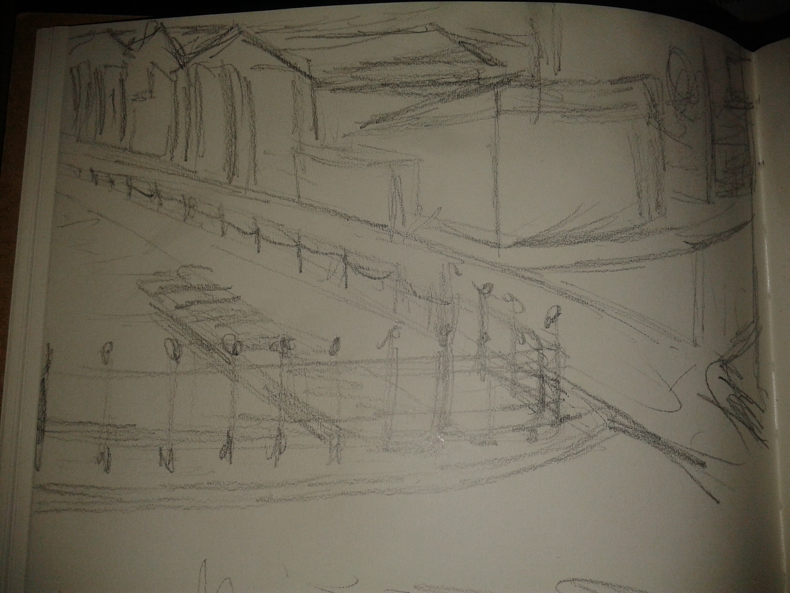

After drawing the three views of the street, I decided to draw the object within the environment so that I can show more of the details which are within the street itself.
The first set of drawings I did are in the first image below and are of a few different items but I drew them quickly and only did the basic shape but went into more detail compared to the previous street drawings and put more detail so that other people that view the images have a better understanding of what they are.
The images I sketched after that I did at an even high detail and tried to show the little tiny details on normal objects, even the pattern of the bricks on the path on the street (Third image down), and also tried to show how some of the objects fit together/ how they work just by what I see and tried to translate that into my drawings.


Other Practitioners
Scott Homer – Here.

This image has been done very well and has a great sense of perspective and a great use of colours, the green in the image from the moss, trees and plants really shows that the natural world is reclaiming once lost land from an once lively urban civilisation which is now in ruin.
The shadows the artist has added into the environment has really made the image look more realistic and gave it a better sense of depth making the image feel as if it is a real place and that you could really go and visit it. The contrast between the brown (from the rust and dirt) and the green (from the plants) really helps brings the idea of live and death into the image (what I mean by that is that it shows as I said before that humans do not populate this area anymore but you see that live is going on with all the plants regaining the land) .
David Lesperance – Here.

This image is amazing and uses 3D within its creation which really helped in making the image have a better sense of perspective once rendered. The design makes the tower look massive due to the artist making the top not visible in the shot. I like the way that the artist has made the lighting reflect of the large structures and putting the other side (part of the structure facing away from the light source) put into darkness; it really allows for more detail to be shown on the building and in my opinion, makes it feel like it has been blessed by the gods.
Link to interview here.
We have been set the task to find Typography artist which have worked on and designed type/ fonts for companies and brands which can include the company identity itself or brand/ promotion created by the company, and find quote or/and a discussion on the subject of Typography.
The person that I choose was a graphic design artist called Alex Trochut which has done promotional designs for many big brands and company which include Pepsi, FILA, Estrella, Beercelona and a Rolling Stones album artwork .
Below I will show a quote by Alex Trochut on the subject of Typography:
Q – The interviewer: “How did you come to develop the complex style of typography demonstrated in a lot of your work?”
A – Alex Trochut:“For me it’s very important to try do same things in terms of images but in different ways or styles, this is sometimes the goal and concept itself. Often the most challenging part of the process is to figure out the methodology. I try to get lost, discover happy accidents and break my routines. normally it’s hard to find a client that likes to experiment and take the risks that this process implies, so usually I collect my ‘accidents’ and save them for the right occasion.”
By what Alex Trochut quote, I think what he is trying to say is that you shouldn’t be afraid of experimenting with styles and trying different though it maybe a hard to do, you will eventually get there. By the images that I got shown below created by Alex Trochut, you can see that he really does try to push his designed as far as he can and likes to try new styles.


There are two different terms that you use than you are talking about logos, identities and brands which are signifers and signified or signs and objects. both of the words have different meanings and explains different perspectives of a design which allows creators to think more creatively when designing the designs and can help them plan out what they want to create more easily.
Below I will explain what both of these words mean and explain how they can help the creation of designs for logos, identities and brands so the the person viewing the design will recognise the logo to what product they are giving to the consumer.
A signifer is the physical form of the design, it is what the person sees but it doesn’t just stop there, it can include the sound, the text used. This can help with animating the logos which you can see in my post here. Basically all this together can make a more appealing design for a logo or brand for a company so that the audience and the consumer can recognise the company and what they make/ create or give to the consumer.
Signified is what the design shows, unlike signifer (which is the physical look of a design), signified means what the design expressed to the person viewing it and what the design tells the consumers. As an example could be that a sign saying danger would be red because red symbolises danger.
I have been set the task of researching logos, identities and brands for media based companies.
I will have to look into what makes the design good (or bad) and explain what makes the logo appealing (or not appealing).
I started looking at a view different logos from a few different games developers which in the following:
I will not just look at the base design of the designs but the creative ways that the companies customise their company design to suit the product that they are producing to suit the mood that the designers of the games wish the game to set. First examples will be from Naughty Dog from two different type of games with completely different settings and a completely different mood to explain how the designers creatively designed the company logo to suit the game design and setting. I will show the two examples below.
Below is the opening of the game Crash Bandicoot which has a very cartoon like and silly atmosphere which the animated intro to the company logo also shows:
This is Naughty Dogs other game called Uncharted 2: Among Thieves which has a more serious design, which you will also see in the intro that they made the logo match the setting of the game:
As you can see from the introduction of the company logo in both game openings, the logo has the same design but is introduced in a way that matches the feeling of the game so that it doesn’t ruin the immersion of the setting of the games.
Another Example of this is with Ubisoft which I will show two videos of two openings (or trailer openings) of a game to show the look and the design of the intro animation and look of the design:
Watch Dogs
Rayman Legends
As you can see with both of the designs of the introductions of the game companies logo, they are both introduced very differently, Rayman Legends even made the logo turn into one of the creatures from within the game to make the logo suit the theme of the game a lot further to show that “this is part of the look of the game” which I think they did very well in both designs.
Custom looking logos for games doesn’t have to always be animating, as I can show with a few images of EA logos for a few different games which I will show below:
The first logo is the normal version of the EA logo.
The next logo is from The Sims 3, you will notice that they changed the colour scheme to suit the look of the Sims 3 colour scheme which main colour is green.
![]()
The next design is for all the sport games that EA makes which include Fifa series, NHL series, NBA series and so on.
As you can see from the designs of the different logos, you can tell that all of the logos are still the same even though they are designed differently.
![]()
Company logo and identity designs are not just within the gaming media but is within all media from films, books, TV series, social media and so on, but I will talk more about that in the next part.
Throughout the past few weeks, we have been learning how to use a 3D modelling program called “3DS Max” using the version “3DS Max 2011”. This is a product that is created by Autodesk alongside many other programs including the sister program “Maya”.
The first major lessons we were taught is about the interface of the program, learning where all the main and important tools are which where the following:
– The Title Bar
– The Menu Bar
– Main Tool Bar
– 3D viewing Widget
– Command Panel: Contains the Create, Modify, Hierarchy, Motion, Display and finally Utilities Tabs
Within the lessons we have learned the basics of constructing 3D models with the tools within the program. We have been taught two major lessons within 3DS Max which the first was creating a 3D crate to the size given on the worksheet; two weeks later we were taught how to texture the crate we created previously.
The following week, we did something different which was about how to map out basic shapes correctly but without using the program, we used paper and were given the task to map out six different shapes and after had to make a 3D object out of one of the maps by cutting them out and then folding them together to see if you did the mapping correctly.
My first understanding on casual games: 04/11/13 – I think that casual games are games which are easy to understand and play and are first to set up and to get in to without having to learn complex controls and rules. This applies to both video games and board base games, if either of them takes too long to play and/or set-up and is complex to learn, casual gamers will most likely not play the game.
Casual games can be on any platform from consoles, personal computers and mobile/cell phones and even in the arcades.
Games which I would consider as casual games are the following:
– Call of Duty
– Angry Birds
– Tetris
– Pac-Man
– Mario
– Sonic the Hedgehog
– Temple Run
– Facebook games
I have been working in 3DS Max and been practicing creating 3D characters.
Imagine below is of an hour and 30 minutes of work.
I have used the ink n Paint material so that it can render like a cartoon as you can see below.


